Audio Guide

Welcome to Leamington Spa Art Gallery & Museum’s audio guide.
Listen to our curators introduce and talk about some of the artworks and artifacts in our collection.
Simply click on the 'Listen to...' buttons to open the audio file. When you have finished listening, click 'back' on your web browser to return to the Audio Guide page.
If you prefer not to stream audio from your device during your visit (mobile data charges may apply), you can download the mp3 in advance. Simply right click the 'Listen to...' buttons and 'save target as'. You can then save this directly to your mobile device and play the audio file via your preferred audio player. Don't forget to bring your own headphones!
Our first audio guide was a pilot project designed in-house by the Gallery team, who continue to explore how to make Leamington Spa Art Gallery and Museum's collection accessible while COVID-19 restrictions are in place. You can find out how it was made here.
A Picture of Health Audio Guide
Welcome
Welcome to Leamington Spa Art Gallery & Museum. Our current exhibition in the Main Gallery is entitled ‘A Picture of Health: Art, Medicine and the Body’ and considers how modern and contemporary artists have navigated and responded to their experience of health, illness and wellbeing. The subjects they explore range from inherited genetic disease, disability and addiction to medicine and hospital spaces. Whatever their immediate focus, the works on display draw out universal questions about the human experience and challenge long held views about health. When most people will experience some form of illness or disability during their life, why is being healthy seen as being normal? Why are we so obsessed with mental and physical perfection?
Leamington Spa Art Gallery & Museum has a long association with medical therapies. In the 19th century, the Royal Pump Rooms were a place for fashionable people ‘to take the waters’. Drinking and bathing in the natural saline waters in Leamington was considered to cure many ailments. The building was later converted into a hydrotherapy treatment centre, closing in 1999. What is now the main art gallery was originally a swimming pool.
We have been collecting medical art for over twenty years to build on this history and we hope these works will encourage you to consider and question your own relationship to health and well-being.
Introduction to the Picturing the Doctor
When you call to mind a doctor, what do you think of? It’s most likely you imagine a person in clean green or blue scrubs or a white coat. They might be in a doctor’s surgery or a hospital or behind the counter in a pharmacy. These are images we have been extremely familiar with during the pandemic. However, doctors have not always been seen in this way. This display explores how the image of the doctor has changed over time alongside our understanding of medicine. Throughout the 18th and 19th century, many doctors chose to be depicted as men of ideas, appealing to paying clients and highlighting their scientific training as the medical profession became more regulated. They often strove to distinguish themselves from quack doctors who were frequently satirised by artists. This display highlights how our responses to healthcare and medicine are connected to our perceptions of those we trust our care to.
Caspar Netscher (After), A Visit from the Doctor, 1775-1800
Dressed in a rich fur lined hat and cloak, this doctor’s outfit seems far from practical. He gazes into a flask of his patient’s urine to try and discover her ailment. Staring away from her to the right of the painting, has he noticed the letter on the desk or the way this young woman clutches at her heart? The doctor seems oblivious to the diagnosis of love sickness which we, the viewer, might guess at. Caspar Netscher, the artist, pokes fun at the doctor in this image. His theatrical dress indicates that he is a charlatan rather than a trained medical man.
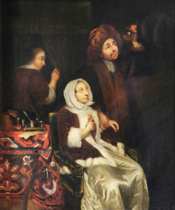
Image credit: Caspar Netscher, A visit from the doctor 1775 -1800
Charles Edward Wagstaff Henry Jephson Esq. MD 1840/1842
The idea of collecting a picture of a famous doctor seems strange today but that was the purpose of this print produced in 1840 and available for purchase by subscription. Doctors, like Henry Jephson, cemented their reputation as learned gentleman doctors through images like this, something that was vital to attract new patients and maintain their medical practice. By this period, Jephson was renowned in Leamington for his treatments using saline water and had an average annual income of around £1 million in today’s money. He further secured his status through philanthropic projects in the town.
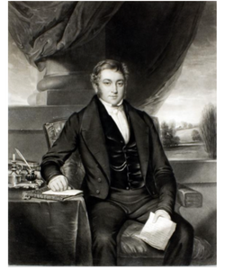
Image credit: Charles Edward Wagstaff Henry Jephson Esq. MD 1840/1842
Christine Borland, English Family China
Among the objects on this shelf, there is a small skull and a human pelvis made of ceramic. They are decorated in the same blue and white colour scheme as the 18th century teapot and cup from our collection that they are displayed with. Both objects feature images of ships with billowing sails copied from 18th century pottery from Liverpool which references the city’s history as a global shipping port for emigrants, slaves and sugar. This work, English Family China, by Christine Borland examines the layers of meaning behind the phrase ‘Bone China’, a type of ceramic incorporating ground animal bone. By fashioning bone china clay into the forms of a mother’s pelvis and child’s skull, and using repeating patterns, Borland mirrors the way genetic patterns run through a family. This idea of inheritance is emphasised through her reference to china dinner services which are often passed down through families.
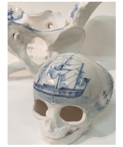
Image Credit: Christine Borland, Set Conversation Piece, 1998, Courtesy of the artist
Michelle Charles, Lydia Pinkham
The light inside these bottles seems to shimmer and glow. Although it might feel as if you could reach out and touch each one, they are forever beyond our grasp. The artist Michelle Charles has created a sense of mystery through the use of camera-less photography. These works are created by placing a bottle on photographic paper and passing light through it, creating an image from the shadow of the object. This enigmatic quality perfectly fits the subject of the work, bottles of Lydia Pinkham’s Vegetable compound, a cure-all tonic popular in the 19th century. Now widely discredited as a quack medicine, the mystical aspect of this work captures something of the promise this tonic held for patients desperate to relieve their ailments.
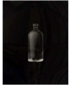
Image credit: Michelle Charles, Lydia Pinkham, 2002, Courtesy of the artist
Marc Quinn, Catherine Long, 2000 - Written and Spoken by Catherine Long
Hello, this is the voice of Catherine Long. I am the human being whose body was used for the creation of the sculpture you are currently encountering. And now I'm going to speak to you from the sculpture’s perspective. I feel cold and exposed. It's really uncomfortable standing here, both physically and emotionally. I don't belong here. I don't want to be an object in this museum. I don't want you to look at me. I don't want to look at you, looking at me.
How do you feel looking at this sculpture? What you're seeing is Mark Quinn's portrayal of Catherine's body. A non-disabled man's perception of a woman who he wanted to use as a
subject to reflect on his observations of how disabled bodies are looked at, comparable to the way that Greek statues are looked at. There is so much depth of experience of Catherine's body that is not portrayed here. Catherine is so much softer, warmer, she breathes and has a heart and blood flowing through her veins. It would be incredibly difficult for her to stand up like this. She does not walk around or move with ease. The process of being cast for my creation involved having her body wrapped, bit by bit, and encased in plaster of paris covered bandages. The same material used to repair broken limbs. It was extremely painful, difficult and cold and it took Catherine weeks to recover from those hours. She had hoped the process could emphasize the beauty of her unusualness. And she had felt it was important for bodies like hers to be seen in more positive settings. What do you see when you look at me? Do you think about Catherine? About your own body? About Mark Quinn? About who gets to control their representation? About who defines wholeness and beauty?
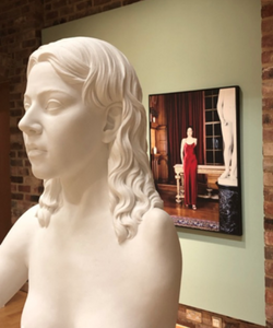
Details of Alexa Wright, I, No. 1 and I, No. 7, 1999 (Left) and Marc Quinn, Catherine Long, 2000 (right), Courtesy of the artists.
Alexa Wright, I No.1 & I No. 2
The two photographs in this exhibition ‘I. 1’ and ‘I. 7’ come from a series of eight digitally manipulated colour portraits made with the help of people with congenital physical disabilities. The idea for this work came from observing the way that people I photographed for a former series, After Image, were often treated as not fully human, because they'd had a limb amputated. In each image in the ‘I’ series, a different disability is superimposed onto my body. All but one of the figures has my facial identity, and that one has my body and the face of someone with Down’s syndrome. The portraits are shot in a colourful, ornate setting where various two- and three-dimensional figures invite comparison or association with the bodies of the subjects depicted. In ‘I. 7’ there’s just a reflection of two women in the mirror whilst in ‘I. 1’, the classical sculpture dominates the right side of the photo. The reflection of the back of the sculpture in the window was an accident that happened because we working late and it got dark, but in the end, it became an important part of the image. In an essay on this work, the brilliant cultural theorist, Mark Cousins referred to the association between beauty, goodness and truth, which is inherited from antiquity and reinforced by Christianity. He writes that “it still remains a stubborn prejudice that these categories belong together. That beauty is truth, and that together they must signify what is good. Within this tradition, what is ugly is evil, and evil is signified by ugliness.” Conventionally, the genre of portraiture is governed by an understanding of these correspondences. Most of the time, we see portrayed artists depicting their cities in a flattering way. Cousins goes on to suggest that the photos in the “I” series disrupt this process, “and in doing so”, he says, “they judge the spectator and find him or her lacking”. Writing this, Cousins has perfectly understood the aim of the work, which is to challenge you, the viewer, to become aware of your own preconceptions, and to notice that when people look at someone with a disability, what they see first is the disability, not the person. Thankfully, attitudes have changed a lot since this work was made in the late 1990s, but I think we still all need to be aware of our own reactions to the ways that we relate to difference. ‘I. 1’, the portrait with the red dress, depicts the shoulder of the artist Catherine Long, who became a close friend of mine after we worked together on this photo. She insisted that the figure that includes her shoulder must look elegant, and I think it's because of her critical intervention that this is my favourite photo in the series.
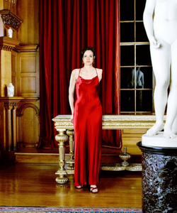
Image credit: Alexa Wright 'I' (1998). Leamington Spa Art Gallery & Museum. © Alexa Wright. Image Courtesy of the artist.
Lyndall Phelps, Silence (written and read by Lyndall)
At first glance these four masks appear purely medical; their form and colour scheme closely resemble industrially manufactured, commercially available medical supplies. However, the meticulous hand-crafted nature of the work and the stillness it evokes, invites the viewer to consider alternative readings of the work.
As the title suggests, this work is about silence. The masks are a symbol for breathing in, breathing out; consciousness, loss of consciousness; repression, liberation; power of communication, denial of speech; and ultimately life and death. The starting point for Silence was the treatment of women in Victorian prisons, who were forced to knit as a form of hard labour. They were made to work in silence for many hours each day, in dedicated knitting rooms where the conditions were often deplorable. The primary function of this activity was to subdue the so-called passionate and reckless temperament of the female prisoner. The women usually made functional objects such as shawls, stockings and caps, which were used within the prison or sold commercially, some going to medical institutions. The physical act of making Silence was highly significant. Each mask was extremely labour intensive; being hand knitted and crocheted with embroidery thread, the repetition of stitches echoing the female prisoner’s hours of work.
I made Silence a decade before the world was changed by Covid 19. The mask, now a critical component in fighting the disease, provides protection from and containment of the virus. It has developed into the most visible icon for the pandemic, used by billions of people worldwide. It is no longer merely medical, becoming a symbol for loss and hardship, for political propaganda, for expressing individualism, and as a result has given new meaning and poignancy to Silence.
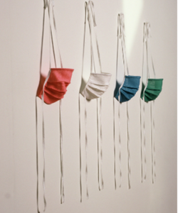
Image credit: Lyndall Phelps, Silence, 2001, Image courtesy of the artist, Photography: Gary Kirkham
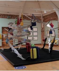
iDNA – Felicity Boardman
My name’s Felicity Boardman and I’m a professor at Warwick Medical school and the lead researcher on the research project behind I:DNA.
I:DNA is an art installation that has been developed directly out of research findings, so it’s the result of an interdisciplinary collaboration between the arts and sciences.
My research explored the views and experiences of families living with a range of different genetic conditions, and asked them to comment on the rapid expansion of genomic medicine which is currently underway, in particular the moves towards screening the whole population for genetic disease. Such screening would identify genetic carriers (or people who can pass on genetic conditions, even if they don’t have it themselves), and therefore influence the sorts of reproductive decisions made now, and in the future, and could reduce the number of people with genetic conditions being born.
The research revealed a really complex mix of views and attitudes, but overwhelmingly, what came out of the research was the view that life with a genetic condition could be simultanesouly hard, but also immensely fulfilling, and called into question the medical view of disease as something to be cured, removed or eradicated.
I:DNA the installation draws on the idea of journeys and travel through life, and visitors enter it through an airport style scanner. They are firstly met by a metal sculpture of a DNA helix, that iconic image. However, this helix is de-naturing, or coming apart, and is being weighed down, or pulled apart by baggage items placed all over it. These items represent the genetic baggage we all carry, whether or not we realise it, and the bags represent the four colours of DNA neucleotides, green, red yellow and blue.
Around the sculpture are two monitors, and these play I:DNA’s soundscape and visual content. The visual content is a series of filmed portraits of faces, and they appear on the screens alongside facts about genetics.
Finally, direct quotations from participants in the research are spoken and sung into the installation space, poignantly bringing home to visitors the human voices behind the conditions, their very human experiences of their lives with genetic differences and their perceptions of the current and future capacities of genomic medicine. Indeed, their stories invite all of us to consider the value that we assign to different types of lives with contrasting genetic makeups, and to think about the future society that genomic medicine could create.
2019 Main Gallery Rehang Audio Guide
Introduction
Hello and welcome to Leamington Spa Art Gallery & Museum, located in The Royal Pump Rooms. This building was designed in the Regency style and erected in 1814 to cater to visitors travelling to Leamington for their health. After the first bath house was built over a natural spring of saline mineral water in Leamington in the late eighteenth century, a thriving spa industry developed in the town and visitors flocked here to ‘take the waters’ and mix in fashionable society. The Royal Pump Rooms contained a grand Assembly Rooms and boasted 20 baths, making it the largest and most prestigious of all the spa bathing places in Leamington. Over the next two centuries, the function of the Royal Pump Rooms changed but it still retained its connection to healing and water. In 1863, it was refurbished to house a Turkish Bath and Swimming pool and was later redeveloped again to house facilities for hydrotherapy treatments. In 2000, the art gallery and museum moved into the Royal Pump Rooms. The collection still retains a focus on medical art and history, reflecting Leamington’s rich past as a popular spa resort.
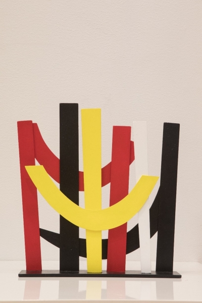
Terry Frost, Untitled, Maquette for University Hospitals Coventry and Warwickshire NHS Trust, 2003
Listen to Terry Frost, Untitled
Although Terry Frost was born in Leamington in 1915, it was actually the landscape and people of Cornwall that predominantly shaped his artistic output. The bright Cornish light and landscape as well as the abstract art produced by a number of artists living there, such as Barbara Hepworth, contributed to the development of his colourful, graphic style.
Frost worked in many mediums throughout his life including painting, print-making and sculpture. This maquette was produced as a three-dimensional sketch for a larger nine-foot sculpture intended for the entrance to the University Hospitals Coventry and Warwickshire but the sculpture was unfortunately never built. His works often included intertwined geometric shapes, particularly semi-circles and arcs, depicted in saturated colours just like those seen in this model. Frost was fascinated by colour, once saying that he knew of at least 87 shades of black. His ultimate aim was to create harmonious abstract art in which form, colour and shape were in perfect balance.
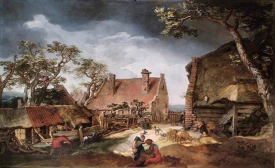
Abraham Bloemaert, The Prodigal Son, 1615
Listen to Abraham Bloemaert, The Prodigal Son
This painting by 17th century Dutch artist Abraham Bloemaert depicts a scene from the parable of The Prodigal Son, a story told by Jesus in the Bible. The prodigal son (prodigal meaning extravagant or wasteful) squanders the inheritance given to him by his father and is forced to return home, penniless and destitute. Rather than shun him, however, his father welcomes him with open arms. It is a story of redemption and forgiveness. Bloemaert masterfully captures these two concepts in one image. Whilst the prodigal son, dressed in rags, kneels in the filth of a pig sty, his hand clutched to his chest in remorse, a beam of heavenly light shines down upon him, indicating God’s forgiveness of his sins.
Bloemaert has re-located this biblical scene to his native home of the Netherlands. The prodigal son is depicted on a rural farmyard, surrounded by peasants going about their daily business. In the background a woman feeds her chickens, whilst in the foreground a man bundles some sticks together. Bloemaert makes it easier to relate to the story by setting it in a location that his 17th century audience would recognise. The parable of the Prodigal Son was popular in paintings of this period as it advocated Christian virtues and warned citizens of the prosperous new nation of the Dutch Republic against extravagance.
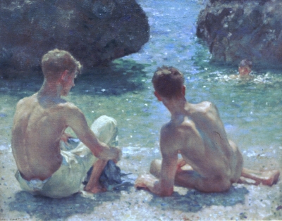
Henry Tuke, The Critics, 1927
Listen to Henry Tuke, The Critics
Henry Scott Tuke’s The Critics depicts three nude or partially clothed young men relaxing on the beach in Cornwall. Working at the turn of the 20th century, Tuke was strongly influenced by the contemporary fashion for painting outdoors, or en pleine air, and the majority of his paintings are bathed in warm, natural Cornish sunshine which delicately lights the flesh of his models and sparkles on the surface of the sea.
Although he also produced portraits and maritime scenes, Tuke is best known for his paintings of nude young men. These works are undeniably sensual and homoerotic although never explicitly sexual. Tuke’s circle of friends consisted of a number of artists and writers, such as Oscar Wilde, who celebrated homosexual desire, often drawing on Ancient Greek culture in their work. The classical, statuesque depictions of the male figure in Tuke’s paintings shows he was also influenced by the art of Ancient Greece.
At a time when homosexual activities were illegal in Britain, much of Tuke’s work explores the idea of hidden desire. His models are often depicted from behind, not touching but intently looking at one another. Tuke plays on the relationship between what the viewer can see and what they can imagine.
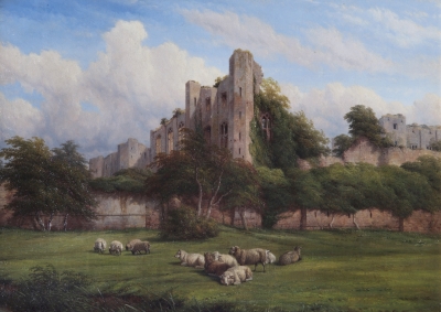
Thomas Baker, Lord Leycester Tower, Kenilworth, 1862
Listen to Thomas Baker, Lord Leycester Tower
During the late 18th and early 19th centuries, landscape painting became increasingly popular in England. Thomas Baker capitalised on this trend by producing over 800 landscape scenes, predominantly of the Warwickshire countryside. His paintings were carefully constructed to appeal to buyers, showing idealised local scenes.
In this painting, Kenilworth Castle, the historic home of Queen Elizabeth’s favourite courtier Robert Dudley Earl of Leicester, is depicted as a romantic ruin, overgrown with luscious foliage.
Baker has refrained from showing the often-grey reality of British weather, giving the castle a backdrop of white clouds and blue sky. Baker was highly influenced by the Italianate landscape paintings produced in France and the Netherlands in the 17th century, where artists depicted northern European scenes lit with Mediterranean sunshine.
Bright blue skies, lush green pasture, relaxed farm animals and picturesque ruins were characteristic of Baker’s landscapes. The composition of this painting is pleasingly symmetrical; the line of trees divides the painting almost exactly in two, adding to the sense of harmony and peace Baker has depicted.
Mark Titchner, We Want Responsibility To Be Shared By All, 2006
Listen to Mark Titchner, We Want Responsibility To Be Shared By All
This is one of ten posters commissioned in 2003 for Gloucester Road Underground Station in London. The words in this piece come from ten phrases taken from the corporate visions of the world’s top ten brands, as they were published in a randomly selected week. By prefacing the statements with ‘We Want’, Titchner creates his own set of commandments that seem almost revolutionary. The addition of two small words encourages us to buy, not into a new product, but into a new vision of society.
Titchner describes his art as ‘a dialogue about how you receive thoughts and ideas’ and his work explores the tensions between the different ideologies that underpin society, be they political, social or religious. Titchner collects text from a variety of different sources including song lyrics, philosophical treatises and political manifestos.
The heavily stylised font and background of this work references that of trade union banners emphasising Titchner’s exploration of the tensions between capitalism, global corporations and the labour movement.
Titchner is interested in how we are shaped by external influences, particularly advertising, in our everyday lives and he often displays his work outside, on billboards or walls.
Unknown Artist, Portrait of James Bisset
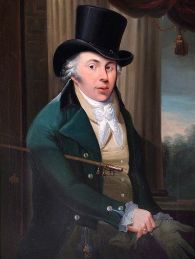
Listen to Portrait of James Bisset
James Bisset, depicted here putting on a pair of gloves, wearing a top hat and holding a cane, looks as if he is about to walk straight out of his own portrait. Whilst these items indicate that he may be preparing to go outside, they also mark Bisset out as a refined and fashionable gentleman in 19th-century society. The signet ring on his right hand, his bright white lace cravat and the pearl buttons on his waistcoat and jacket also indicate Bisset’s wealth and status.
Bisset was something of a local celebrity in Leamington after moving here in 1813. He established a museum, picture gallery, library, newsroom and shop in the town. Bisset was one of the keenest advocates for Leamington’s attractions and wrote a guidebook celebrating the town’s healing waters and spa baths. He punctuated the guidebook with poems such as this one entitled ‘Rules for Drinking the Waters’:
At early dawn prepare to rise,
And if your health you really prize,
To drink the waters quick repair,
then take a walk to breathe fresh air,
Hie thro fields – or promenade
Round pump rooms grand, or colonnade.
A second glass now take – what then?
Why! Take a pleasant walk again,
The Waters, exercise and air,
Will brace your nerves, your health repair.
Then to your breakfast haste away,
With what keen appetite you may.
Elizabeth Whitehead, Peonies, 1928
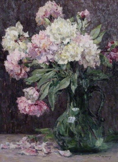
Listen to Elizabeth Whitehead, Peonies
Like many female artists in the late-19th and early 20th centuries, Elizabeth Whitehead was encouraged to specialise in painting still life subjects. Fruit and flowers were considered appropriate, feminine subjects for a woman to paint and could be easily worked on in internal spaces that were perceived of as safe for women. Whitehead became a consummate painter of flowers, of which this is a fantastic example, but also produced some landscape and coastal scenes.
British art schools in this period often barred female students from attending life classes. Whitehead was only able to get a full artistic education when she moved to Paris as a young woman with her brother, the artist Frederick Whitehead, to study art at the Académie Julian. She travelled around France for three years, absorbing art and culture, eventually returning to Leamington to teach painting.
Although flowers may have been a traditional subject to paint, this work by Whitehead is nonetheless brimming with beauty and creativity. The energetic brushwork of the flowers makes it seem as if they have burst into life, scattering petals in an explosion of colour, while the reflections in the green glass vase give it a jewel-like quality.
Copy of a Dutch Defltware Cistern, 1880-1900
Listen to Copy of a Dutch Defltware Cistern
This unusual ceramic object, made in the shape of a house, is a lavabo or water cistern, used for hand washing. The roof, which is decorated with flying angels, can be detached and the square vessel filled with water.
The cistern has been designed to look like a piece of Delftware, a style of ceramics developed in the Netherlands in the 17th century, renowned for its detailed blue decoration on a white background achieved through tin glazing. The domestic scene decorating the side of the cistern features everyday activities, such as smoking and taking tea, which were commonly depicted in visual art from the Netherlands in this period. Delftware was incredibly fashionable across Western Europe due to its similarity to ceramics from East Asia, which were costly and could be difficult to import.
This cistern, however, was probably made in the late 19th century by the French company Samson, Edme and Cie which specialised in reproducing ceramics from museums and private collections. The firm never intended to deceive its audience and endeavoured to mark their works to distinguish them from the originals. This practice was not entirely consistent however, leading to confusion about the authenticity of some objects. A 19th century lavabo which is almost identical to this one can be found in the collection of the Metropolitan Museum of Art in New York.
LS Lowry, The Mission Room, 1937
Listen to LS Lowry, The Mission Room
The industrial landscape, simplified buildings and match-stick figures in this painting are characteristic of LS Lowry’s depictions of working-class life in Lancashire in the inter-war years. Although he attended art school in Manchester and Salford, Lowry described himself as self-taught, and he was famed for his deliberately naïve paintings.
It is likely that this work, painted in 1937, is a combination of elements from several different views of Lowry’s home in Pendlebury. The roof tops and chimney stacks in this painting appear in other works by Lowry, including in a preparatory study of a town on the back of the canvas of this painting. This study gives us a vital insight into Lowry’s artistic practice by showing that he often reworked and revisited some of his favourite views when creating new paintings.
The prominence of the Mission Room in this painting, the equivalent of a modern-day community centre, perhaps indicates Lowry’s desire for refuge and sanctuary from his real-life concerns. Throughout the 1930s, Lowry cared for his bed-ridden mother. This placed huge emotional strain on the artist, perhaps contributing to the development of the muted, distant tone of this work. Lowry casts himself as an observer of rather than a participant in the world around him, highlighting his loneliness at this time. ‘Had I not been lonely,' Lowry once said, 'none of my works would have happened.'
Tell a friend: